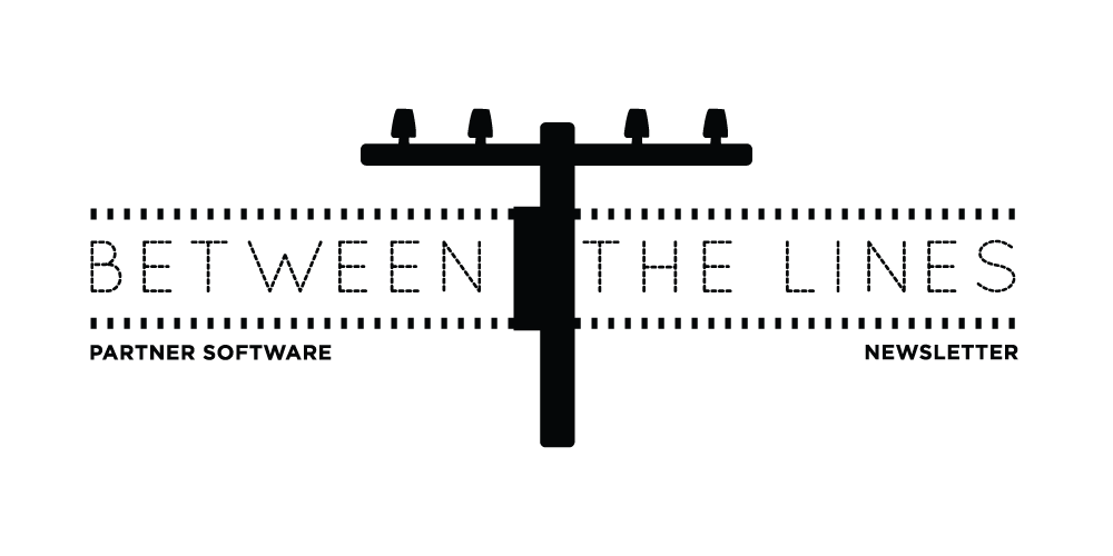
I suggested that Partner Software should give its newsletter a branded name to help them stand apart. We explored a variety of utility-themed names before settling on Between the Lines.
I created a vector illustration of a utility pole and then explored different typeface combinations. The lines of dashes added some extra structure and a simple sans serif was chosen for the secondary text.
Visit PartnerSoftware.com


