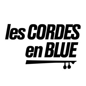
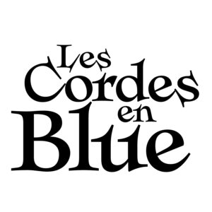
This is a fun budget logo I did for some local Madison musicians. I offered 10 sketches, 5 digital mockups, 3 refinements, and a final logo over the course of a few weeks.
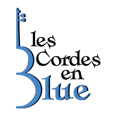
The band had an instrument neck shape they wanted to morph into the “B” in their name. I tried this as well as some other deviations in conjunction with some typefaces.
In the end, the band selected a nice shade of blue to add for a single-color version. Please check out Les Cordes en Blue on Facebook.
Here are a few samples from the logo development process that show some alternate possibilities.
