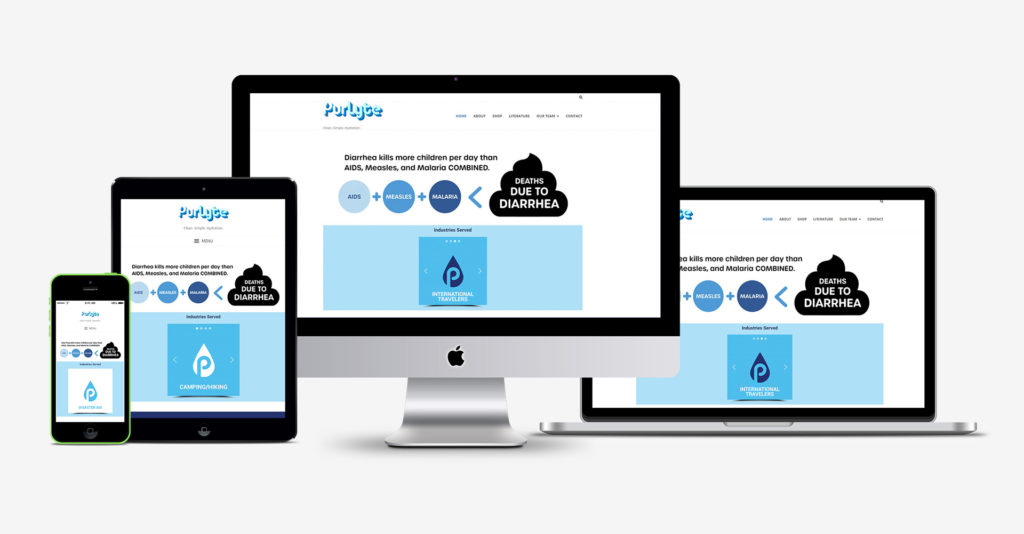
Purlyte is an anti-diarrheal product that combines water disinfection and hydration in one tablet. I was approached by the company to give their site a makeover as they move towards their product launch.
I reviewed the existing site and decided that it needed more visual interest on the homepage, so my first move was to incorporate a few images provide from their marketing slides. The next step was to add a slideshow that highlighted the various industries served by the product. I was careful to add good alt tags and descriptions to improve the SEO of these image additions.
The existing site had a lot of text on the home page. I removed a few paragraphs and reduced the text size. This also encourages the user to dig deeper on the About and other interior pages for additional details.
The About page already had good content and structure, so my main role here was in reducing padding and margins around the elements, and cleaning up the mobile versions of the layout.
My contribution to the Our Team page was streamlining the fonts and type sizes on each member’s description.
I hid the e-mail address on the contact page to help fight spam bots scanning pages for exposed addresses to harvest.
The text section of the contact page also required some work with type size, padding, and margins.
In the end, I was able to modernize the look of the site, clean up back-end issues, create a handful of custom graphics in just under a week.
