This project involved setting up a mini-website and creating custom branding for a software user conference event.
I initially submitted a design that incorporated the corporate colors and some stock images that were seasonally appropriate and had a tech convention feel.
After some discussion with the Marketing team, we decided to go in a more fun and colorful direction. The group wanted to convey bright colors, and had a tagline of “stay curious.” I did some Googling to discover yellow is the color most associated with curiosity. This led me to generate 3 color themes with yellow as the key color.
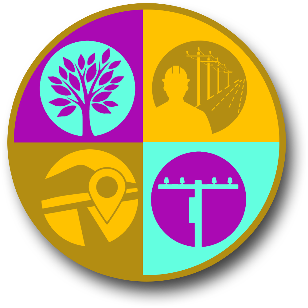
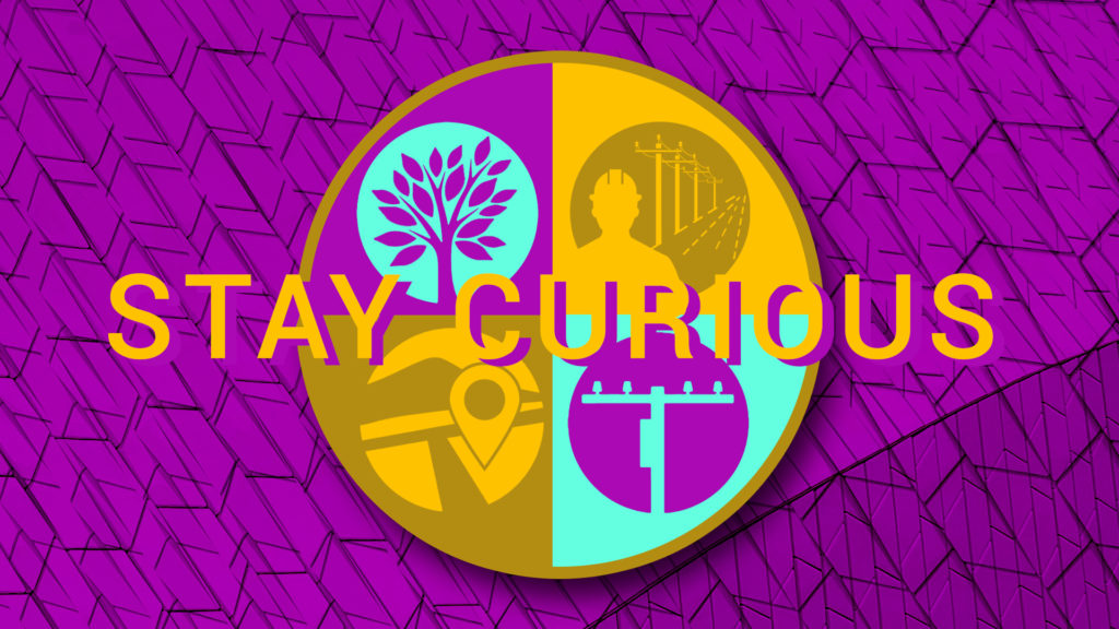
They also offered hands shaking as a potential creative element. This sparked an idea in me based on Pink Floyd’s Wish You Were Here album art. I adapted the circle element to fit the Partner design by replacing the seasons with icons for software solutions. Some effort was made to replicate the handshake, but ultimately it interfered with the icons and tagline, so a simplified version can be seen below.
The Partner logo received a yellow treatment as well. You can see the finished mini-site here.

